Restaurant | Branding
Paternoster Chop House, London
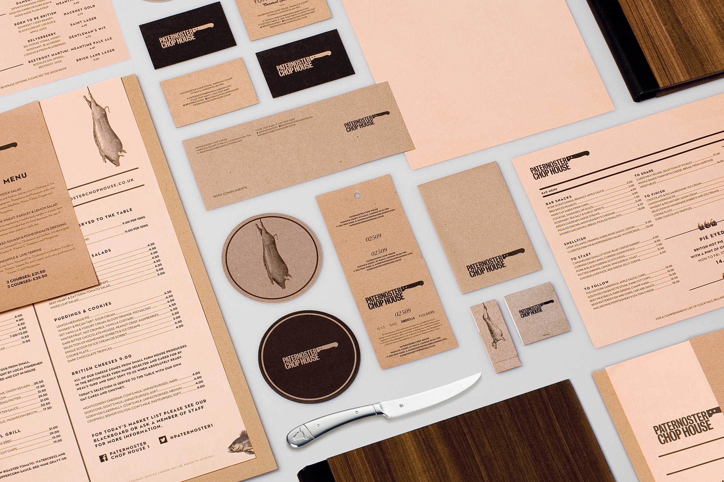
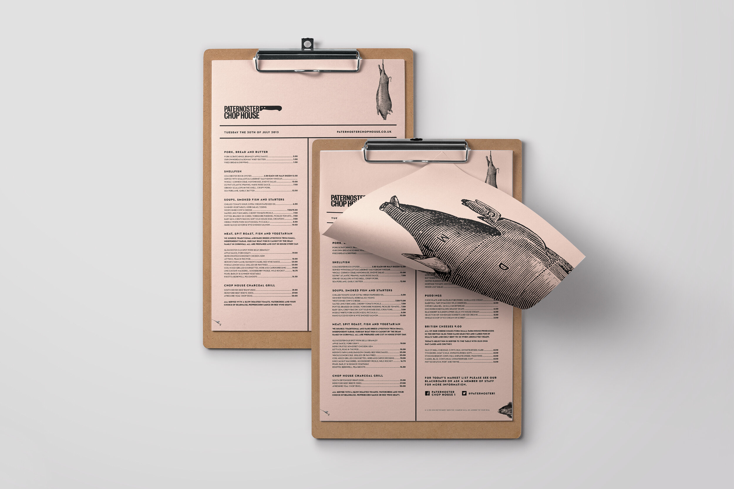
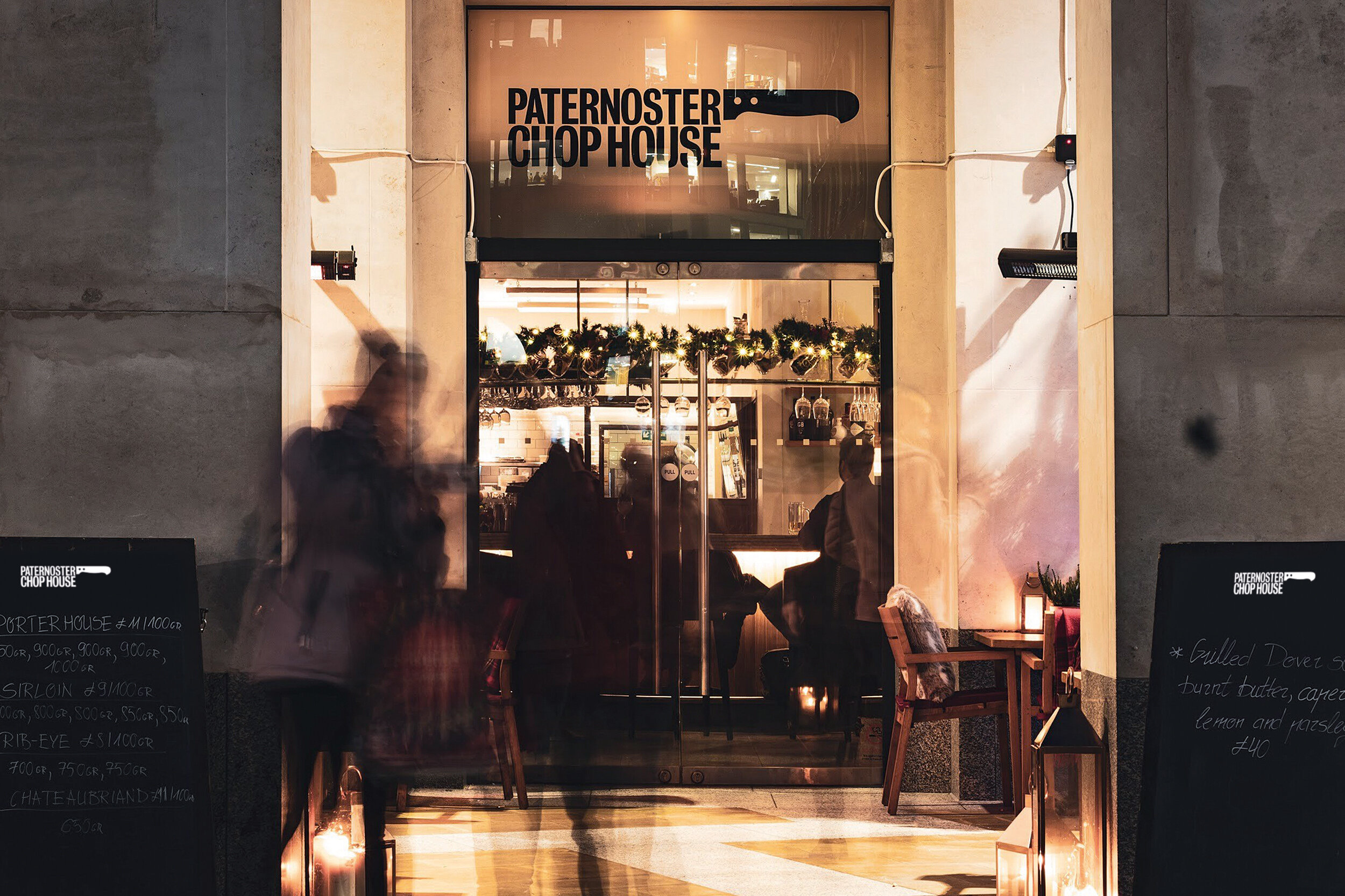
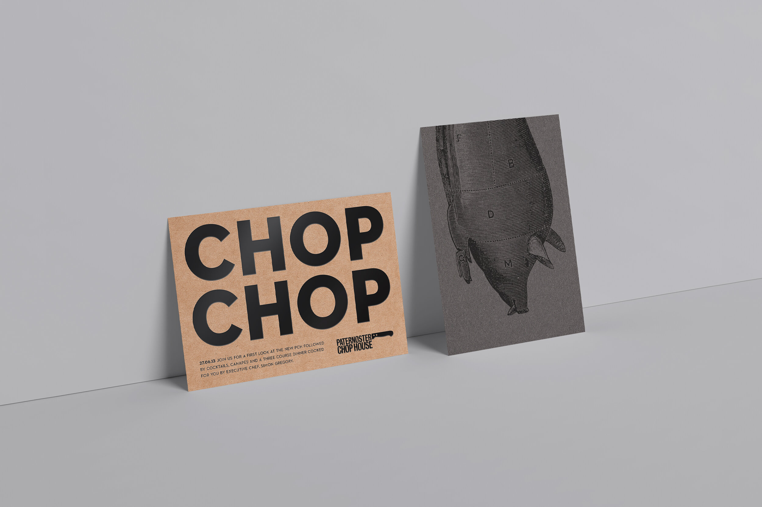
When we were approached to address the Paternoster Chop House brand, everything was neat and tidy, but the personality of a venue with plenty of those qualities just wasn’t being communicated. A wealth of visual inspiration, from a tough, masculine interior to the venue’s location, gave us lots to play with. By taking the existing logo and adding a handle we created the ‘cleaver device’, echoing their famous cleaver window statue – sometimes the best ideas really are staring you in the face. Using the interior and the cuisine as further inspiration, we used tough, heavy papers, wood and a salmon pink colour to create a brand that now makes as much of a statement as the food it represents.
The resulting rebrand was so successful that it was ultimately rolled out to other restaurants across the D&D London group.
BRAND IDENTITY DESIGN, ILLUSTRATION ART DIRECTION, DESIGN FOR PRINT.