Spirits | Branding
Jensen’s Gin
After a period of rapid growth, Jensen’s Gin found their sales levelling out. They realised they had been placing too much emphasis on what they sold rather than what they represented. They were all about much more than great gin. They were at the forefront of the craft alcohol movement in London and had a heritage that other brands could only dream of. This, mixed with a loyal, local following, pointed at a strong emotional cue; pride. London became the focus of the brand. Their customers’ feeling of belonging and attachment is much stronger than their desire to drink gin and this is reflected by a brand that loves London as much as they do.
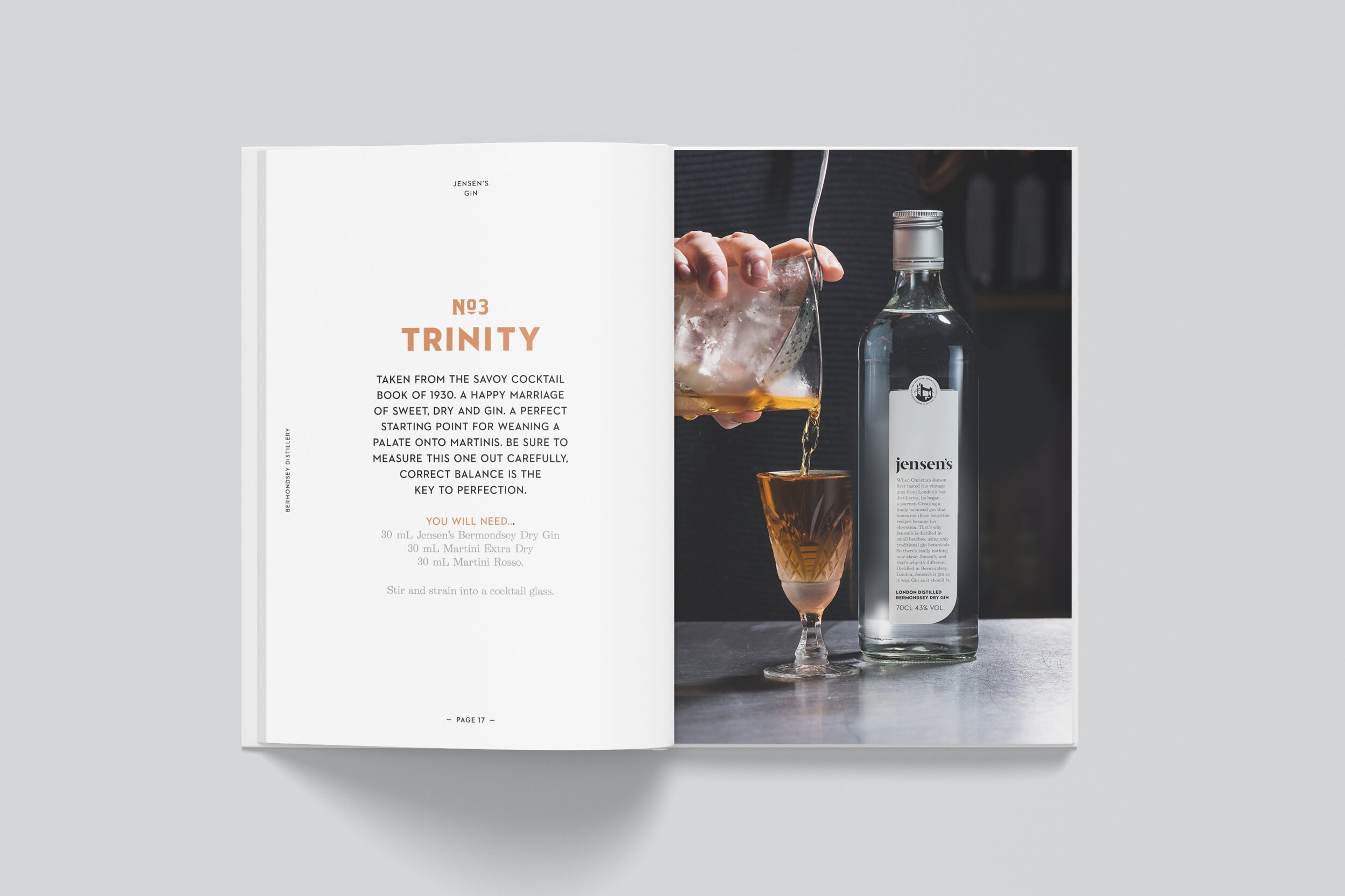
BRAND POSITIONING, BRAND IDENTITY DESIGN, TONE OF VOICE, DESIGN FOR PRINT, SIGNAGE, PACKAGING.


