Soft Drink | Branding & Packaging
Go Kombucha
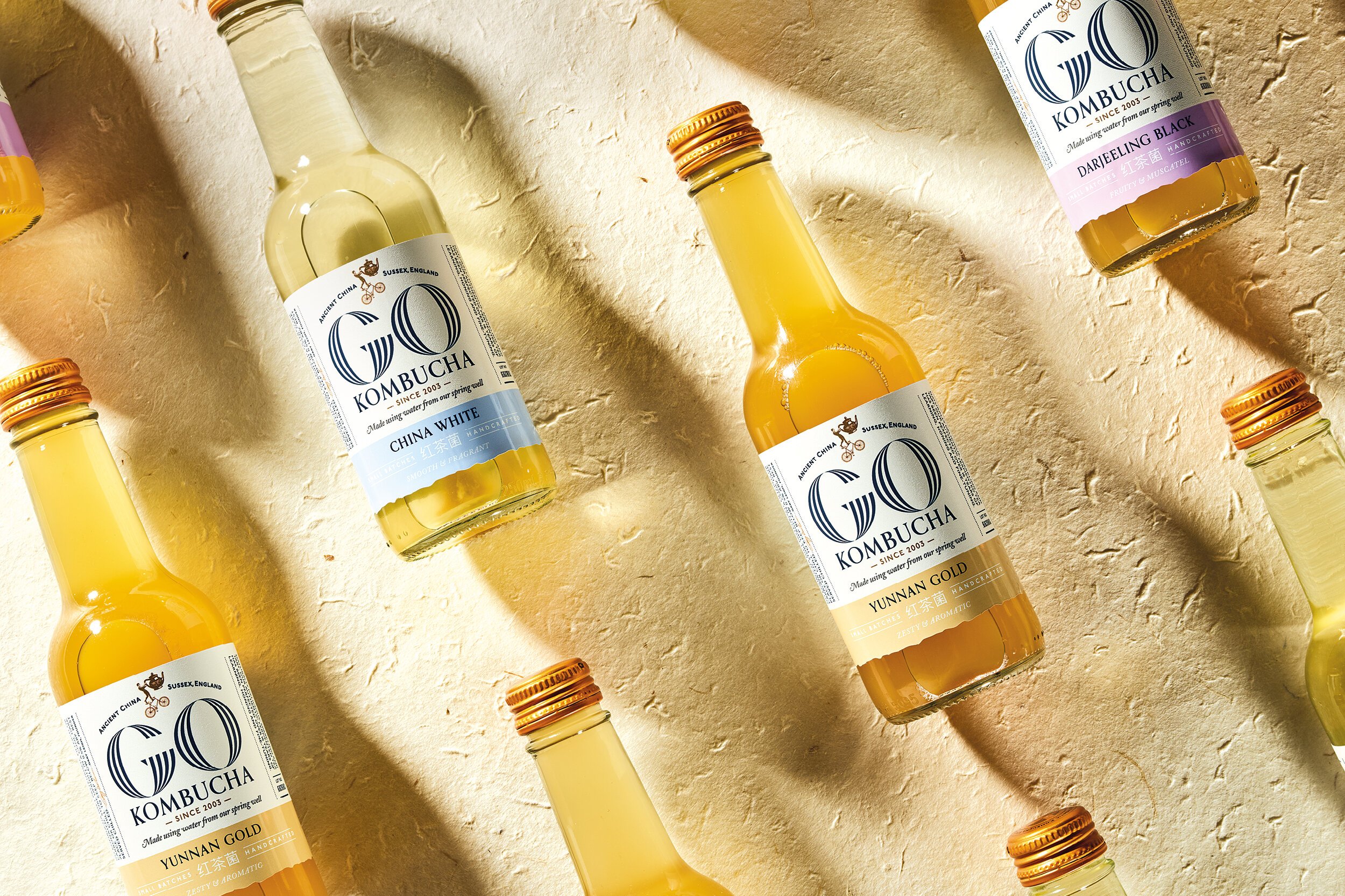
Everyone’s heard of Kombucha these days, but when GO was founded in the early Noughties it was a very different story. As an early entrant into the sector, they’d earned their stripes and were widely respected as one of Britain’s very best ‘booches’. Their kombucha is made the traditional way with no corners cut, but their brand wasn’t in the same good health. Our task was to refresh their approach across packaging and collateral without losing a loyal customer base in the process. Our positioning laid down a marker: GO would be the gold standard, the “benchmark in booch”. Focusing on authenticity, quality and doing things the right way. The look and feel takes cues from the premium whisky sector while avoiding masculine overtones, placing them at the top of the pile and the absolute best in glass.
BRAND AUDITING, BRAND RESEARCH & ANALYSIS, BRAND POSITIONING, BRAND IDENTITY DESIGN, PACKAGING DESIGN, DESIGN FOR PRINT