

Roast, Glasgow
How do you create a café brand that feels unmistakably Glaswegian without relying on any of the usual Scottish clichés?
For Roast, we looked beyond what Glasgow looks like and focused instead on what the city feels like. Warm, characterful and famously friendly, but with a particular way of expressing it: direct, dry and rarely overdone. There’s affection in the attitude and humour in the understatement.
Our brief was to create something modern, distinctive and impossible to miss. So rather than borrow from Glasgow visually, we built a brand around its personality.
CAFE BRAND IDENTITY DESIGN
DESIGN FOR PRINT

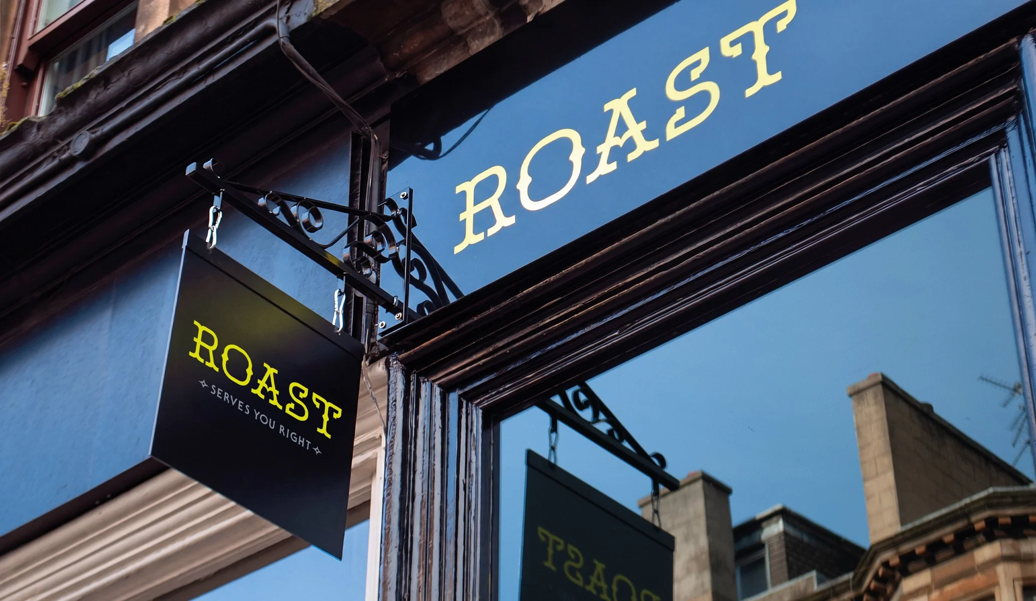
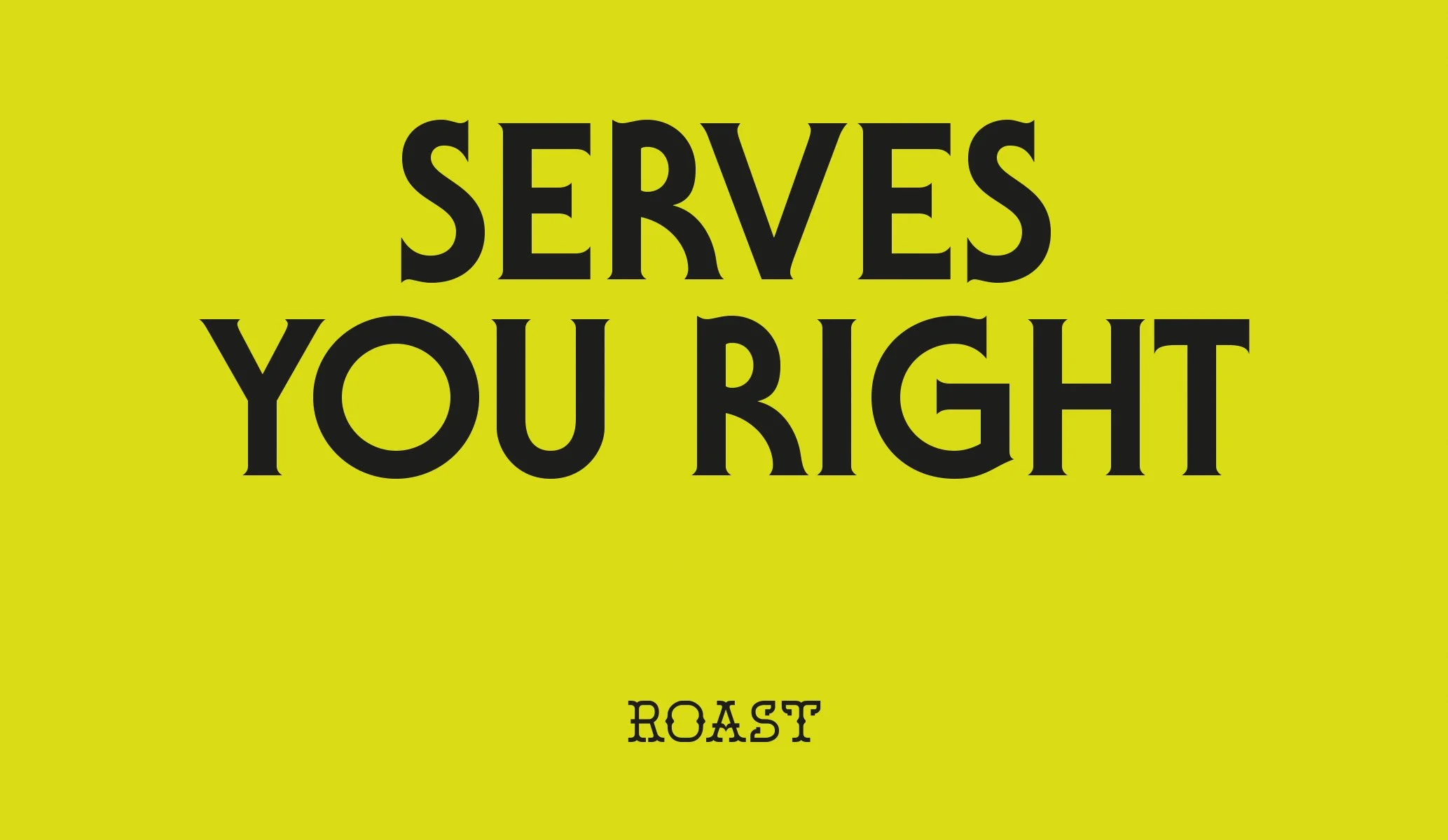
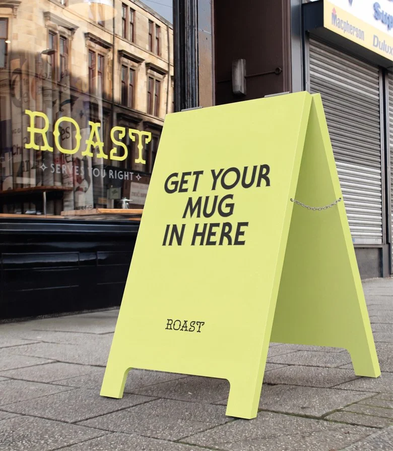
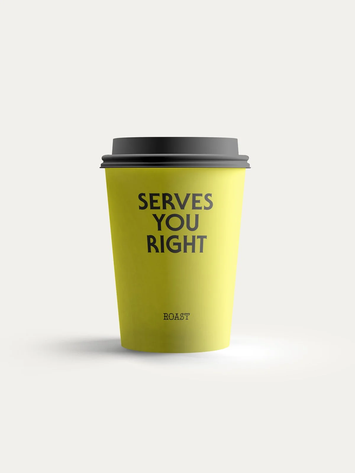
At the heart of Roast is a simple idea: Serves You Right.
Part promise, part put-down, the line captures the duality we wanted the brand to have. Read one way, it’s reassuring: good coffee, good food and service done properly. Read another, it has just enough edge to make you wonder exactly what you’ve done to deserve it.
That attitude gave us a voice for the whole brand. Short, straight-talking and knowingly deadpan, with warmth hiding just beneath the surface. Get your mug in here. Get a grip. You’ll get what you deserve. The language never tries too hard to be funny. Like the best Glaswegian humour, it simply says what it has to say with a wry smile, a wink, and moves on.
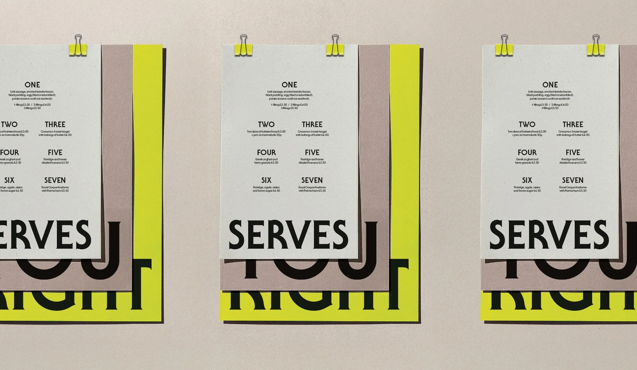
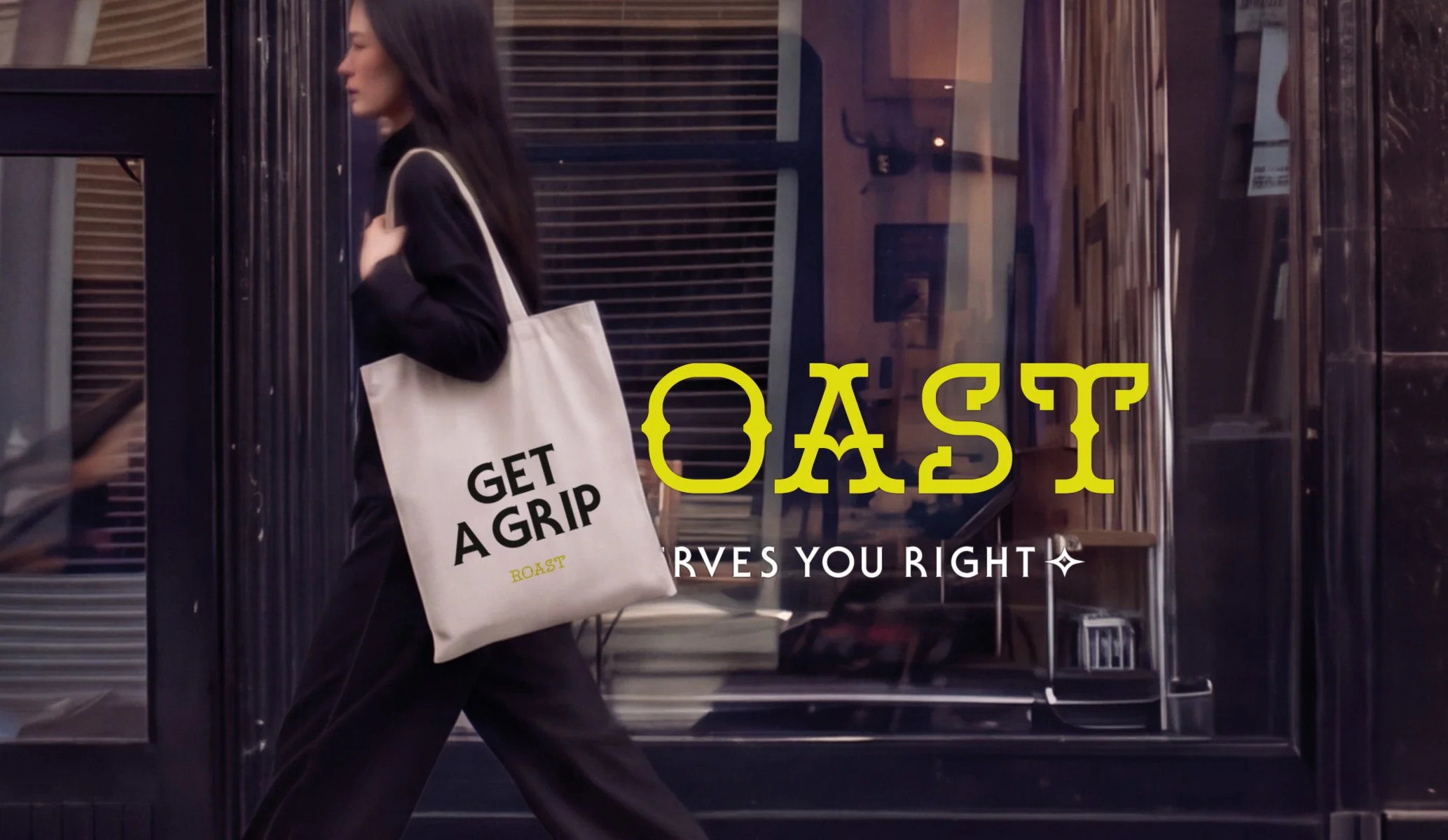
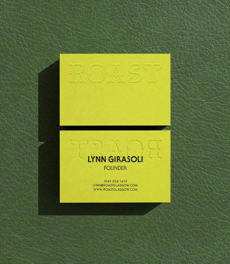
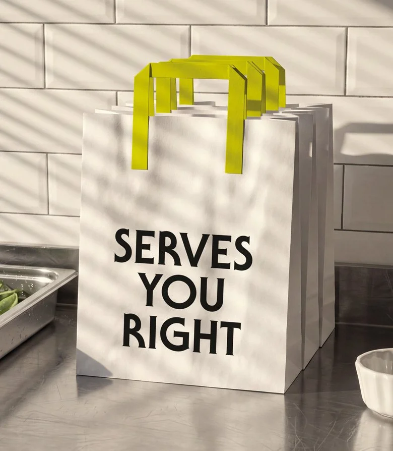
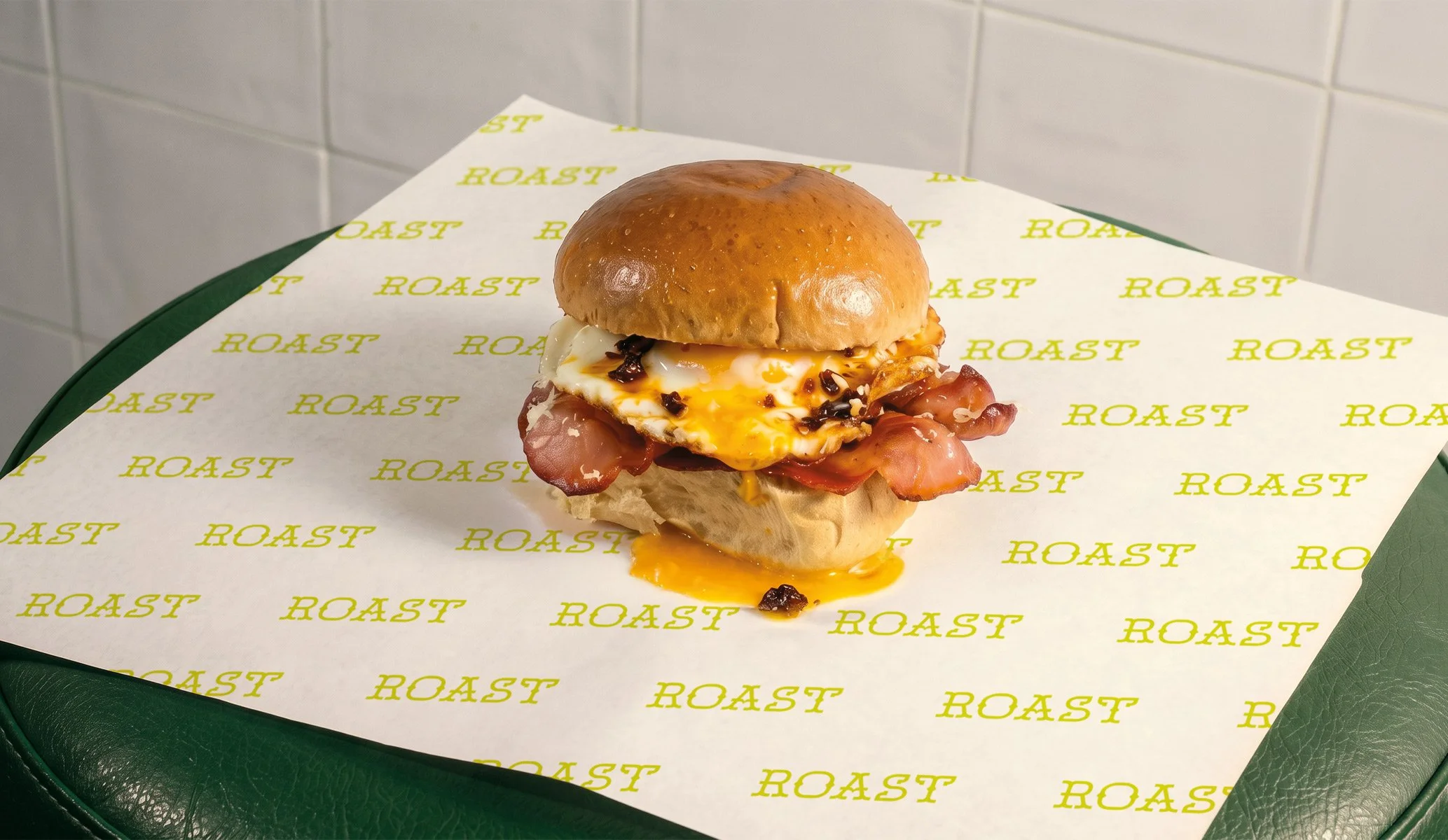
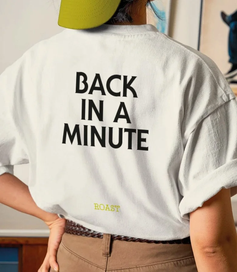
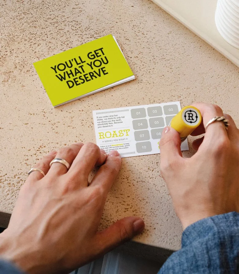
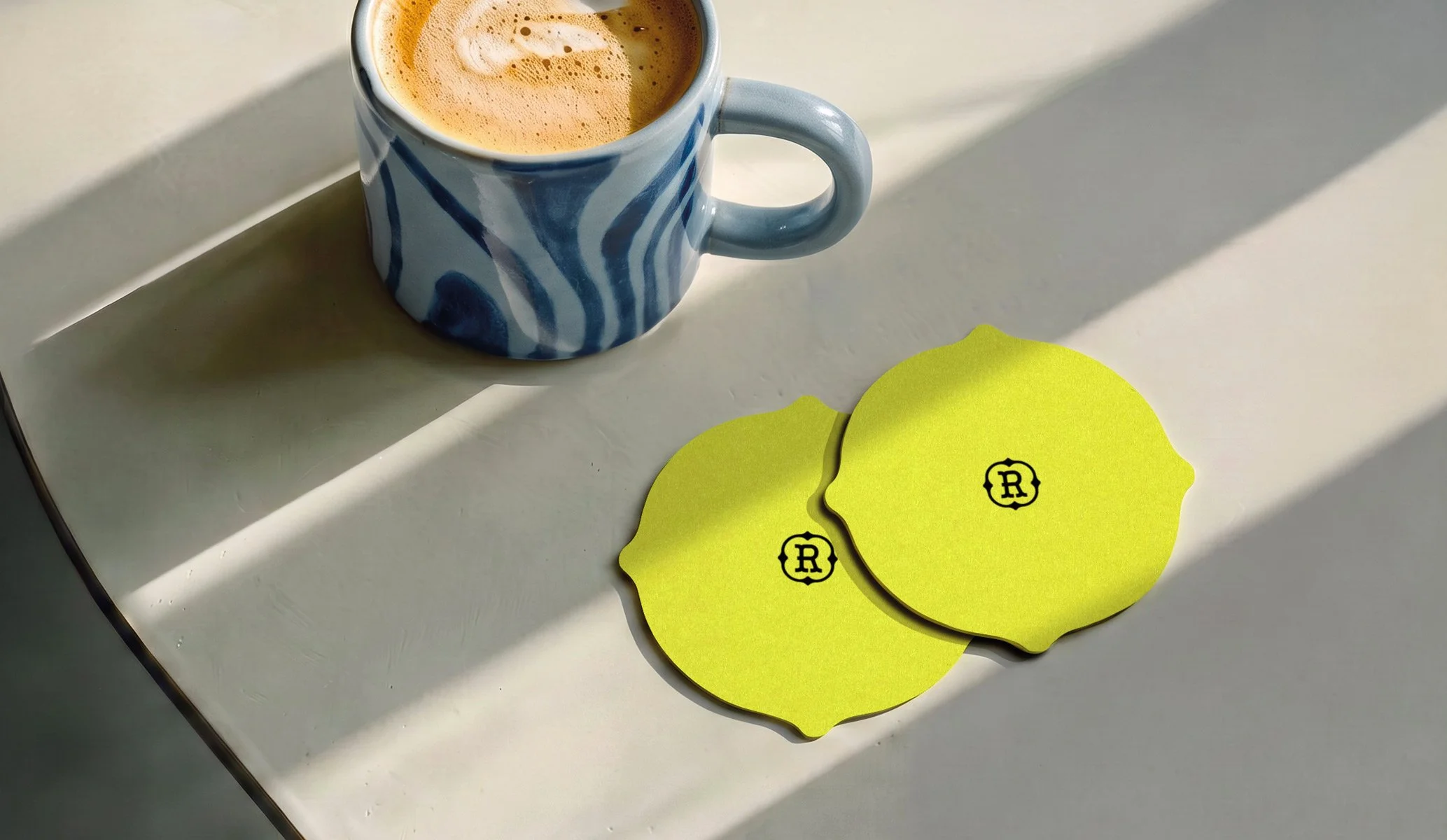
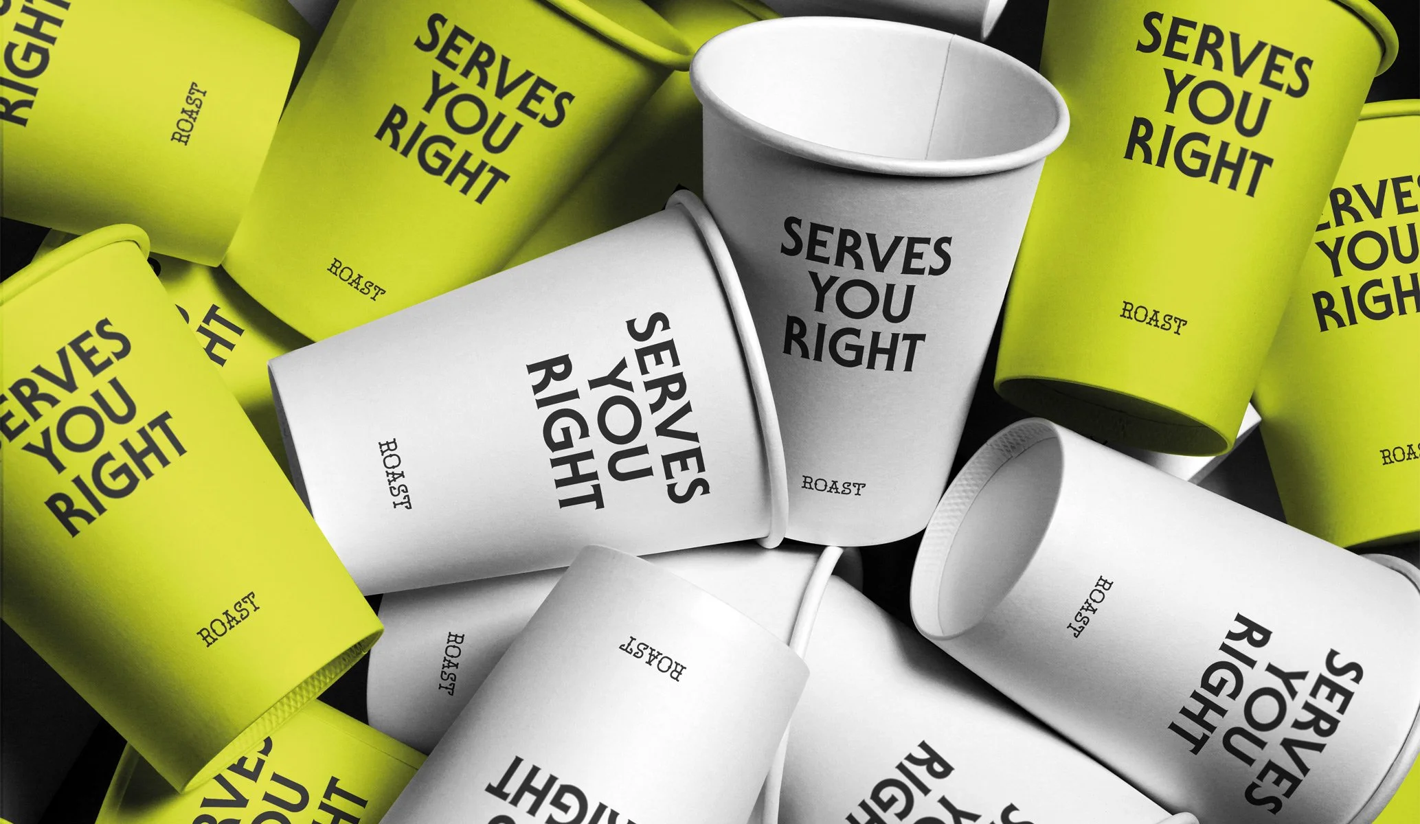
Visually, we wanted Roast to be every bit as direct. A distinctive typographic wordmark gives the identity character, supported by bold typography and an unapologetically bright acid yellow. Against Glasgow’s stone, grey skies and darker shopfronts, the colour brings its own little patch of sunshine — countering the city's famously changeable weather.
The deliberately limited visual language allows the personality to come through wherever the brand appears. From cups and menus to bags, clothing, signage and the smallest customer touchpoints, words become as important as the logo itself.
The result is a brand with Glasgow in its bones rather than written across its face. Bright, bold and full of character. Friendly, just not too friendly. Serves you right.